Providing focused access to the features that are most beneficial for engaged Serve users, such as: Add Money, Bill Pay, and View Balance.


Initially, the Moment team worked with the Enterprise Growth design team at American Express to redesign a full of features, responsive website, which was primarily catered to new Serve users. This included: Account Management, Onboarding, Promotions and Education. Then, we redesigned the Serve Mobile Apps to create a product that facilitates the most common user actions rather than provide access to every feature on the site. We liked to think of those platform as: “If the responsive website is a luxury sedan, then the mobile apps is a sports car.”
MY ROLe
In this year long engagement, I joined the team during the design phase and I was responsible for the visual design quality of the product to the market. Specifically, my role included: extending the visual system, documenting and QA support to developers for the iPhone, Android and iPad apps. I was also responsible to translate the design for other partner brands, such as Bluebird. The whole process was highly collaborative among the design, development, and product team with weekly design reviews and stakeholder presentations.
VIEW THE APPS
THE APPROACH
We created a universal application (an app designed on a single code base) to work on multiple devices running the same operating system without the need to design and develop a new application for the same product every time a new device is released (the iPhone 6 & 6+, for example). From a visual perspective, we created a white-label platform that could be easily utilized with partners, such as Walmart and Target.
Understanding the user need
Through two research sessions we learned that a large amount of the Serve users depend on their mobile phones to manage their finances, even when they aren’t on the go. That’s because, often times, their mobile phone is the only device they own to access the internet. Given this insight, our main objective was to create a platform where the users could easily and quickly complete their main financial tasks, such as: Adding money to their account, paying a bill or viewing their balances.
Our guiding principles
- Evaluate the solutions based on our target audience’s behaviors.
Provide access to key actions quickly (Add Money, Bill Pay, View Transactions, View Balance, Accept Transactions).
Balance(s) should be easily available to the user when the context calls for it.
Provide clarity around the different balances and what actions can be taken with each.
Consider that the apps have a limited feature set, by design.
Web views can’t be supported. The experience can point to the responsive site, but does not allow pass through (users will need to log in again).

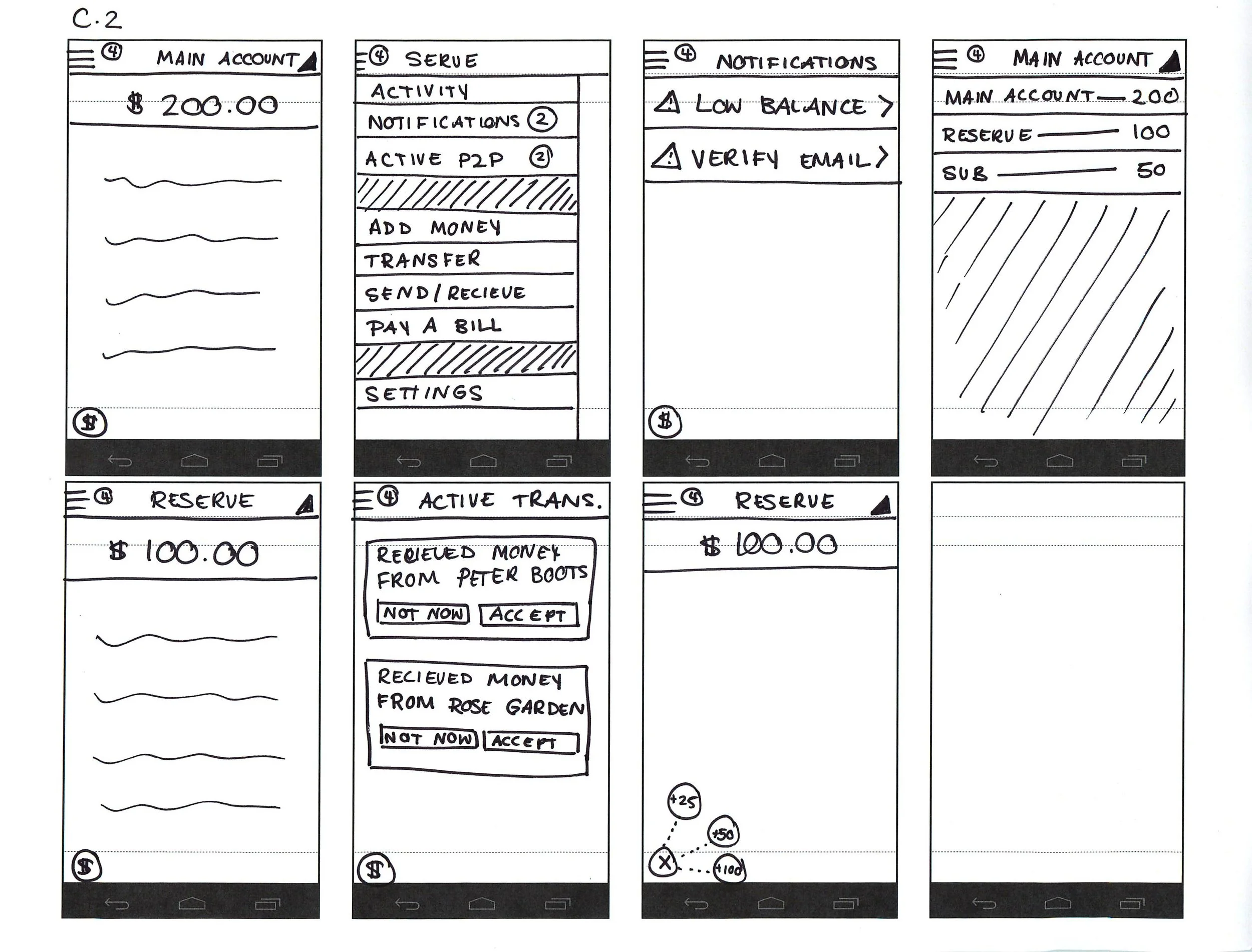
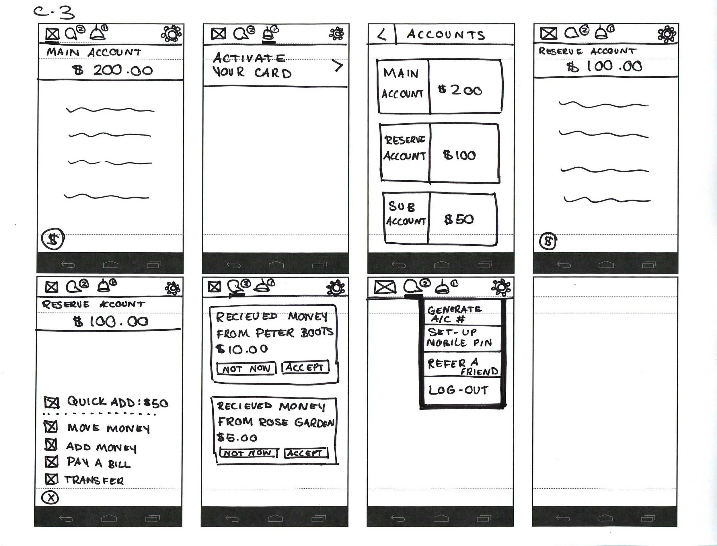
Group sketching for the Main Navigation
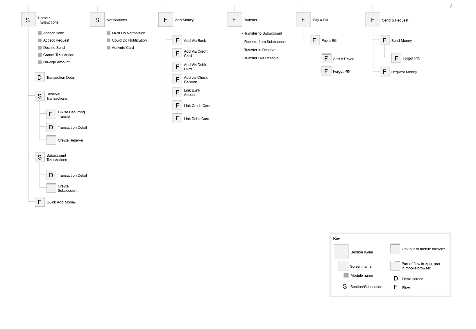
iOS App Map: Logged In Experience
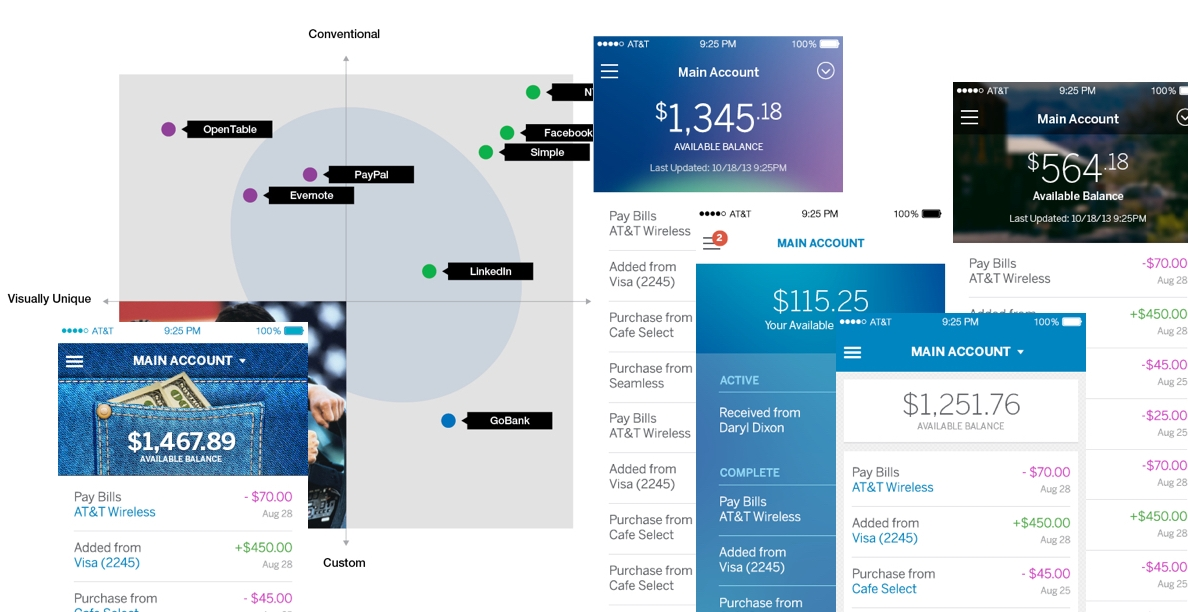
Visual Design Exploration
Collaborating with the technology team
Our team created an environment to encourage frequent and direct feedback cycles with developers. The developers were made aware of design decisions early in the process, which allowed them to voice any concerns right away. This allowed us to refine and reconsider our designs to accommodate any technology constraints. We were given a new build of the apps each sprint, which allowed us to validate that the app was being built as the designs were intended, and track any bugs with Github.
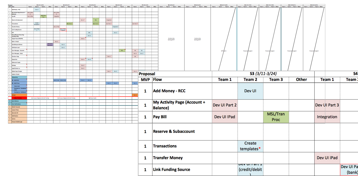
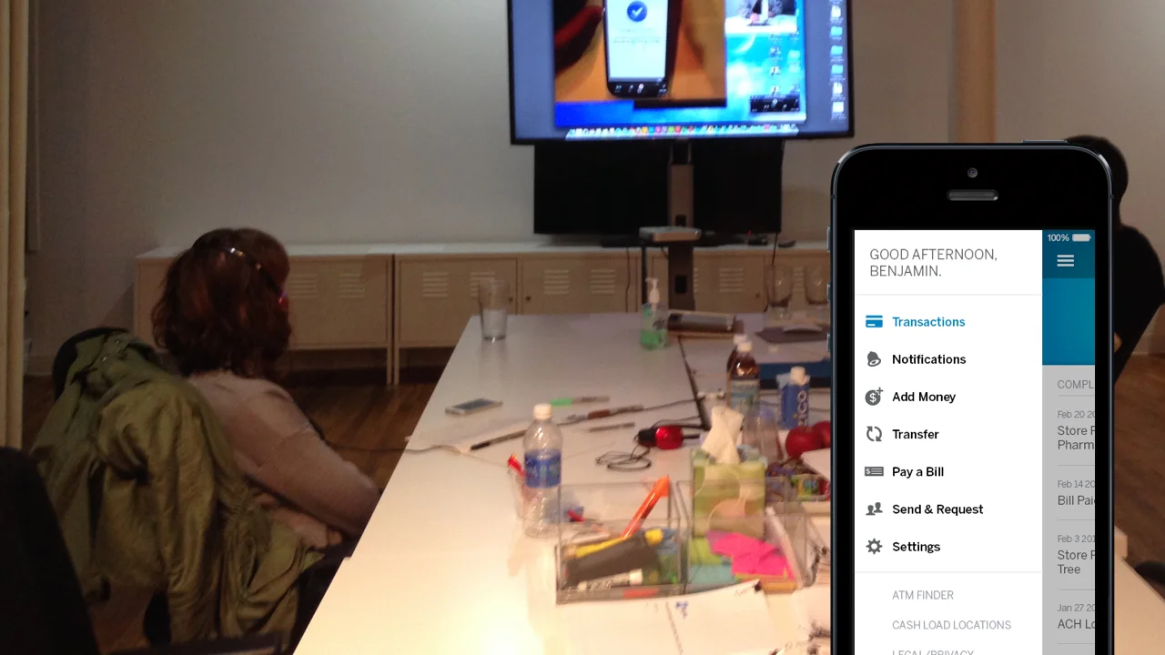
Sprint planning with the dev team
Handing off the deliverables
We delivered documentation sprintly (every two weeks), in small consumable chunks. This included an experience design specification and a graphic design specification for flows being delivered. This documentation was used for the QA process. In addition to the formal documentation, we provided screen by screen visual design clickthroughs for every flow. We also prototyped whenever possible to demonstrate interactions and design intent to developers.


Selected screens demonstrating standardized styles across devices